Geometric mosaics look simple. A row of fans, a sunburst, a chequerboard border. In practice they are the least forgiving designs we make: a figure can hide a small error, but a straight line that wanders by a few millimetres is obvious from across the room. This is how our artisans plan and build geometric work, and how to choose a geometric design that will suit your space.
Why geometry keeps coming back
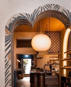
Geometric pattern is the oldest language in mosaic. Roman borders used meanders and interlaced guilloche; Byzantine and Islamic workshops took geometry further than anyone; and in the 1920s and 1930s Art Deco designers rediscovered it in hotel lobbies, cinemas and ocean liners. Mozaico has written about the current revival of Art Deco mosaics; here we look at the workshop side: what it takes to make those lines stay straight.
Start with the grid
Every geometric design begins with a grid drawn at full size. Symmetry is decided first: is the pattern mirrored left to right, rotated around a centre like a rosette, or repeated across the surface like a tile? That choice dictates where the design can be divided into sections for production and shipping, and where the joins will fall.
Cutting to size, not to shape
For figurative work, artisans cut each tessera to fit the shape beside it. For geometry, we do the opposite: tesserae are cut to consistent sizes first, then laid to the grid. Uniform pieces keep the joint lines even, and even joints are what the eye reads as precision. Curves, like the arcs of an Art Deco fan, are built from slightly tapered pieces so the rows bend smoothly without opening wide gaps on the outside of the curve.
Colour does the heavy lifting
Geometric designs depend on contrast. Two marbles that look clearly different side by side on a sample board can merge into a single tone at three metres. We test colour pairs at viewing distance before committing, and we usually limit a geometric design to three or four main colours plus one accent. Classic Deco combinations, such as black, ivory and gold, or deep green, cream and brass, work because the contrast survives distance and low light.
Choosing a geometric design for your space
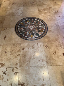
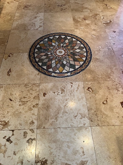
- Match the scale to the room. Small repeats read as texture, which suits bathrooms and splashbacks. Large single motifs, like a sunburst or a compass rose, suit entrances and feature walls.
- Follow the architecture. A pattern that lines up with a doorway, a window or the centre of a floor looks intentional. One that is slightly off-centre looks like a mistake.
- Consider the light. Polished stone and glass reflect strongly, and in a geometric design reflections can break up the lines. Matte marble keeps the pattern crisp.
- Leave room to breathe. A geometric panel framed by a plain border, or by plain wall, looks stronger than one that runs edge to edge.
Where geometry works best
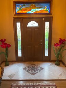
In our experience, geometric mosaics are at their best where people pass through rather than linger: hallways, entrances, stair landings, hotel lobbies and the floor in front of a fireplace. The pattern gives a space structure without competing with the furniture or the people in it.